After I got my HEY invite during its first week of launch, I started enjoying email again.
I now have a better email workflow using HEY than what I had using Gmail or Spark or even the Apple Mail app.
In this post, I’ll share my HEY workflow and talk about why I chose to pay $99/year for email.
Pay using data, or money
Even before I came across this tweet from DHH, I was already paying for email.
The first brand-new product from us at Basecamp in many years is coming this April: An email service (not a client) built for people who both love and hate email. We'll fix the hate, and leave you with the love. Email is amazing, and it deserves our best. https://t.co/J7OCCTFX2Z
— DHH (@dhh) February 6, 2020
I had shifted from free email to a paid one on Fastmail back in December 2019.
There we two core reasons behind this decision:
- Data privacy. It was time I stopped tech giants like Google from harvesting my personal and financial data for ads.
- Truly owning my email address. With a free email on a shared domain, you never truly own your email address. It’s just a rental that might vanish anytime the service provider wishes. Having my email on a custom domain meant I could hold that email address as long as I wished. Also, I could change providers anytime without changing my email address.
If you’re not paying for a product, then you are the product.
With HEY, the first problem is solved. I’m paying them for their service which leaves out negligible motive for them to mine my data for profit.
And, HEY’s not cheap. It’s $99/year which comes down to $8.25/month. I was paying $5/month on Fastmail.
Apart from the super expensive Superhuman email client, HEY stacks up amongst the top-tier of email providers when it comes to pricing.
However, paying money doesn’t automatically mean they will not snoop on my data. I remember almost paying for Otter and then quickly removing it from my phone when I went through their privacy policy.
To dig deep, I went over HEY’s privacy policy, and it checked out. No major red flags.
I did say major because there were a couple of quirks including:
- Cookies to track user activity.
- Not respecting a Do Not Track request.
However, I can live with that.
But, what about the lecture on truly owning an email address?
It turns out; HEY offers that too.
Although, there is no support for custom domains as of now, they do commit to roll out the feature later this year.
Here’s a reply from DHH on my tweet:
Can’t wait to try this out. Hope it launches with a custom domain feature. https://t.co/qkm2x1vO1l
— Rahul Chowdhury (@chowdhuryrahul) May 27, 2020
But, that’s not all. If you pay for at least one year of HEY which is $99, you get to keep your @hey.com email address, forever.
If I cancel my HEY account next year, I would still be able to receive emails on my @hey.com address if I choose to forward all incoming emails to a new address.
It seems pretty reasonable.
We receive a lot of emails, including sensitive ones like password reset and transaction logs on our email address. Being held hostage and asked to pay a ransom of $99/year just to keep the email address would have been unethical.
Although, I don’t want to move away from HEY anytime soon, this option seems like a good backup strategy.
Privacy aside, I also love HEY for these features
If HEY offered only privacy, I would have happily stuck to Fastmail. I was getting a good enough privacy-friendly email for half the price when paid yearly.
But, HEY’s more than just a privacy-friendly email.
Let’s start with:
The screener
The screening feature is a game-changer for me.
I used to do all the hard work of making a filtering rule on my Gmail and Fastmail to weed out any unnecessary emails, but HEY makes it so easy.

Filtering out was a second step in my “konmari” inbox process. My first step was to unsubscribe manually or by using a tool like LeaveMeAlone.
If I kept getting emails even after unsubscribing, I wrote filtering rules.
HEY screening is the reverse of what I was used to, and it made total sense. I regularly screen-in or screen-out emails and keep my actual email workspace tidy.
Instead of reacting to spammy senders, I am proactively blocking them out of my inbox.
For example, I recently subscribed to the Dense Discovery newsletter, and the verification email landed on my screener:
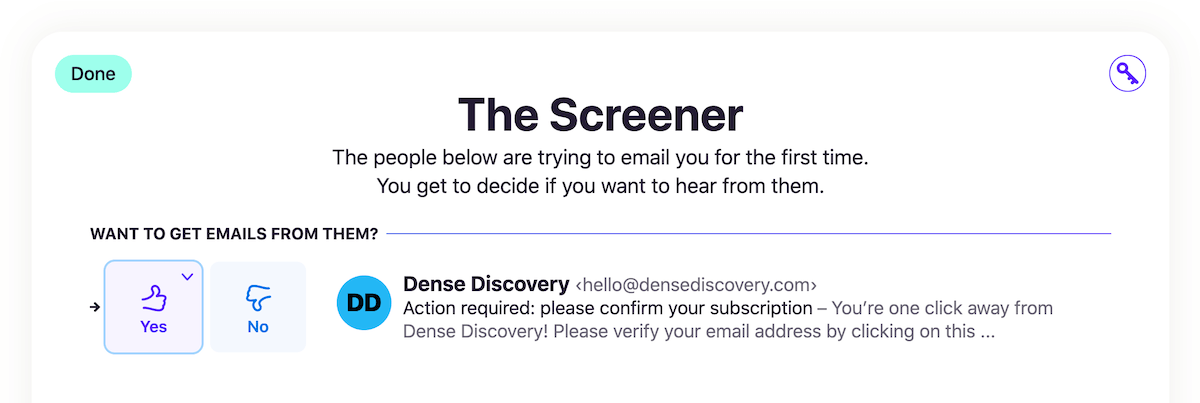
I have seen tweets about why the screener is only helpful for famous people who get tons of emails from unknown senders. I don’t think that’s the case.
This feature has been super helpful for me because I get spammed by a ton of agencies to buy their services.
Example:

What’s the worst part?
They usually don’t have unsubscribe links and often send the same email from different addresses.
Even the filters won’t permanently block these senders from reaching my inbox and cluttering it up.
With HEY, they never get past the screening list. If I ever change my mind about a sender, I can always screen them back in on the Screener History page.
For some people, screening might seem like a lot of work. For me, it’s an organising feature I love.
Talking about newsletters:
The feed page is a delight
HEY’s feed page is how newsletters should be read.
We are already used to reading posts on social media in a linear feed.
Why not have the same approach for newsletters? They’re mostly like social media posts.
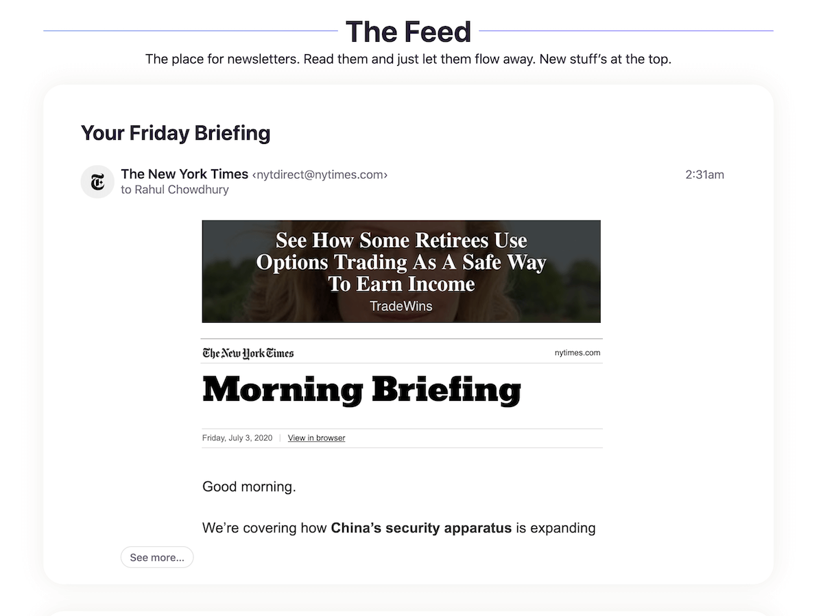
I usually visit this page 2-3 times a day and scan through the newsletters I receive.
Unlike Gmail or Spark, HEY doesn’t have a machine learning system to automatically sort emails into their respective folders.
Frankly, I would have enjoyed an automatic sorting process, but the manual sorting works for me as well. Maybe because I’m a neat-freak but well, what works, works.
To make sure newsletters land on the Feed page, you need to mark the sender’s delivery options on the sender’s contact page:
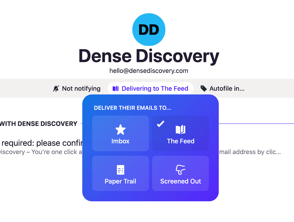
The same can also be done on the screening page. I usually sort emails on my screening page. It’s easier.
Another source of frequent emails which I don’t need to see right now are transaction logs.
With HEY:
Paper trail has got me covered
For me, and I’m sure for a lot of you, transaction receipts are good for referring later on.
I don’t need to see them on my inbox. Neither do I need to read them right now.
The paper trail page in HEY does precisely that.
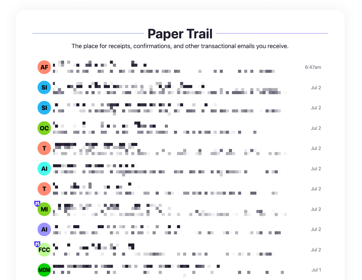
Marking a sender to deliver to paper trail (the same way we marked newsletters for feed), delivers all emails from them to a separate section out of my Imbox.
How is this any different from what Gmail does?
I don’t have to mark the emails as read. They are already in a read state.
I usually open this page up to verify a recent transaction.
Talking about transaction receipts:
HEY has a central place for attachments
How this helps is I can view all attachments from a sender and filter by file type in a single page.
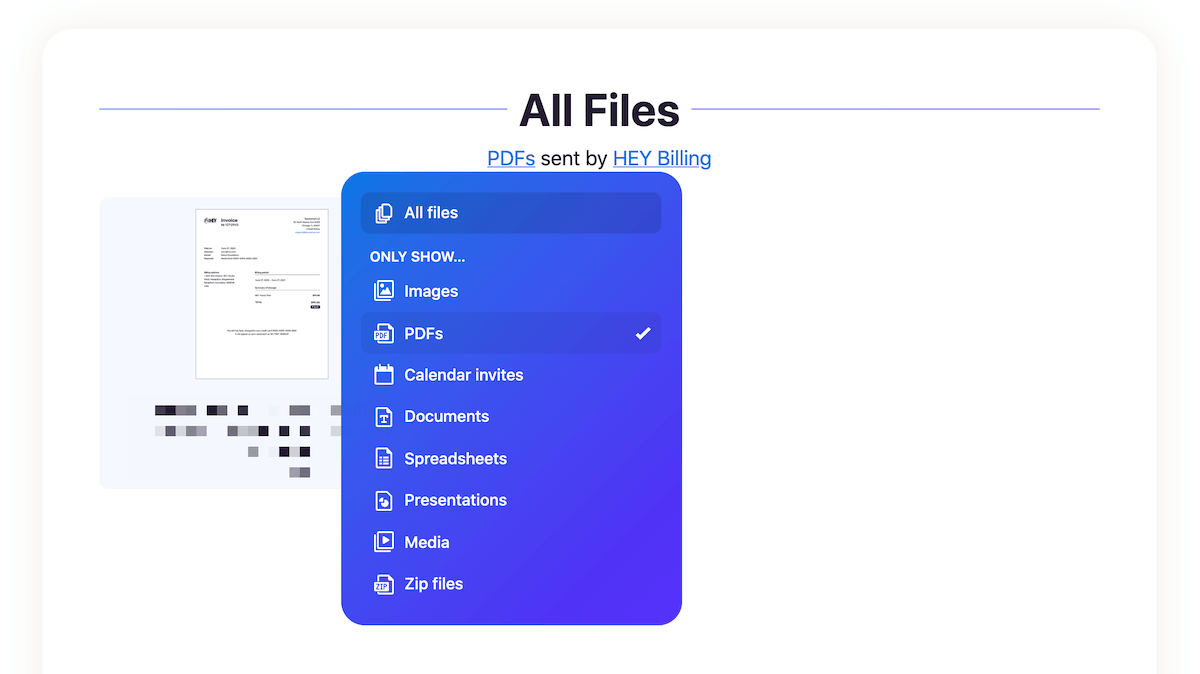
It’s useful in situations where you don’t precisely remember the particular email an attachment was on but know the who sent it to you.
I have had several such moments in the past. Probably that’s why this feature is so important to me.
Apart from these prominent features:
I like how I can reply later or keep aside my emails
Keep aside and reply later are those tiny features which fit into my workflow without disrupting it.
On my regular inbox with Gmail and Spark, I used to keep emails in my inbox, which I needed to refer or maybe reply to in some time.
This approach ensured I didn’t miss out on stuff that I need to get back to in the near future.
With HEY’s keep aside and reply later functionality, the organisation became a little easier and cleaner.
It’s what we software engineers call “separation of concerns”.
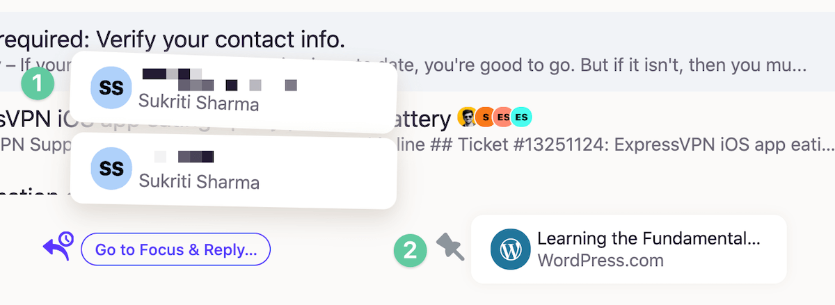
Some use cases where these features fit in:
- Reply later: This is helpful when I know I need to get back with a response to an email, but now is not the correct time. I stash the email away to reply later and then reply when I have time.
- Keep aside: I find this useful for cases like waiting for a settlement to process or maybe some purchase that for which I’ll get a final confirmation a few days later.
Also, there were times where I moved an email from keep aside to reply later when I didn’t hear back from the sender in a few days.
In a sense, both features go hand in hand to make your email processing easier.
It feels good not to have to apply hacks to get something done.
As Jason Fried likes to say:
HEY is all about workflows, not workarounds.
Aside from all these great features, HEY is not a total joyride. It has its share of quirks.
There’s room for improvement
HEY is still at a very early stage. Therefore, it’s safe to say that there will be a lot of iterations in the future, which will make the product even better.
As of now, here are the things about HEY that I don’t wholly enjoy:
The UI
When I first saw HEY, I was convinced that I’d ditch it after a few days of use.
I’m more of a clean and sharp design kind of guy. HEY was playful and bold.
I was wrong.
After using HEY for about two days, the UI grew on me. The boldness and fun aspect of the UI made me excited about email once again.
I can’t remember when I was as excited to email someone as I am right now. Email is fun again.
There are still some parts of the UI that I haven’t been able to accept. One of them is the dark mode.
Take this email, for example:
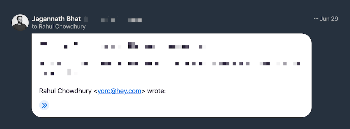
It’s only a partial dark mode.
I would have preferred a full dark mode here. I don’t know what the thought process was behind this UI decision, but I’m guessing it’s done to display the email content colours correctly.
But this block just stands out like a blast of light in a sea of darkness.
The email editor is okay-ish
HEY’s email editor is good enough for most people who are used to formatting by clicking menu buttons.
I’m more of a markdown guy. I fluently format my content as I write.
I’m not saying make the editor markdown compatible, but at least have some basic auto-formatting like convert * to a list item on pressing the spacebar.
Hope HEY will add some fluent formatting support in the future.
I have to check my spam box regularly
I have faced a notable bug on HEY where transaction emails from my bank goes straight into the spam box.
You know what’s nuts?
I have already marked emails from my bank, using the same sender address to land on my paper trail page.
Even after that, some of my transaction emails are wrongly marked as spam.
I have already reported this issue to HEY’s customer support. Hopefully they will be able to fix this soon.
Apart from these tiny hiccups, HEY has been a fresh experience for me.
Update: After reaching out to HEY support, they replied back that they have improved their spam algorithm to prevent these issues. I can confirm that none of my important emails land in spam anymore.
A note here for HEY newbies:
I don’t recommend forwarding emails to HEY
For a lot of people, including me, ditching our old email is not an option.
Forwarding emails from an old provider to HEY is the most natural path to get new emails on a @hey.com address without having to change email address everywhere.
There’s a downside to this approach.
If you still have all of your services linked to a free email like Gmail and just forwarding everything to HEY, you’re basically:
Paying for email with both data and money.
No matter how private and secure your HEY email is, Google or Yahoo are still reading and collecting your data for their ads platform.
If you’re using HEY, use it properly.
I’m dealing with this leak by taking some time out of my schedule to update my email everywhere I can.
This approach ensures my emails don’t pass through a data collection pipeline and stays private.
Should you move to HEY?
It depends on your requirements.
I don’t have any top-secret emails to hide from the government. But I don’t want my personal and financial data being crunched for numbers and used to blast me with ads wherever I go.
Cherry on top?
HEY’s workflow fit mine almost perfectly. It was a win-win for me.
Worth every penny of the $99 I spent on HEY.
Update: After almost a year of using HEY, I’ve switched to a different service. Read this post to learn more about the change.


 In-depth articles, series and guides

