Todoist was the first to-do list app I started using seriously.
After trying out and failing at so many to-do list apps, Todoist was the one which made sense to me.
But, around the start of 2020, I switched to another to-do list app called Things 3 and had been using it for months.
That was until I finally moved back to Todoist last week.
In this post, I’ll talk about what pushed me towards using Todoist in the first place, why I moved to Things 3, and why I switched back.
Let’s start with:
Why I chose Todoist in the first place
My long-standing problem with to-do list apps had been the inability to organise a task on my list quickly.
While every app made it super easy to add a task to my list, organising the task into a project, priorities and timing was a multi-step process.
For each task, I had to jump through multiple hoops to get it adequately organised in popular apps like Any.do.
On Todoist, however, the natural language input was a complete game-changer.
I could naturally type in and organise a task the way I want, like this:
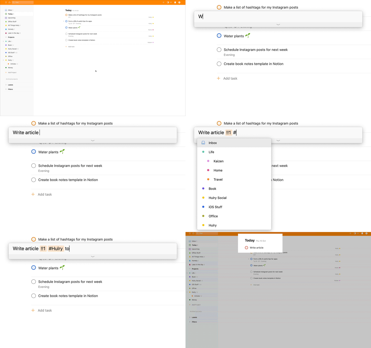
Organising by typing shortcuts is way faster than having to click ten buttons on the screen.
This increase in speed is prominent when I’m listing down tasks in bulk.
I can add and organise a bunch of tasks in a matter of minutes.
Although Todoist offers a ton of other useful features like filters, this one feature was the main reason I stuck to Todoist for so long.
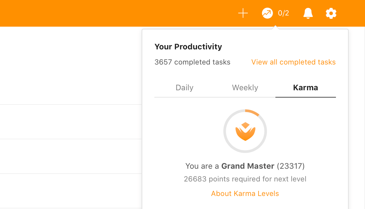
Looking at my stats, I completed around 3600+ tasks with Todoist in one and a half years:
Now:
Although I had been satisfied with Todoist for quite some time, I was blown away:
When I met Things 3
The main problem I had with Todoist was that the macOS app didn’t feel polished.
It felt like the same web app wrapped inside a container and published as a macOS app.
When I installed Things 3’s trial version, I immediately fell in love with the design.
It was beautifully simple.
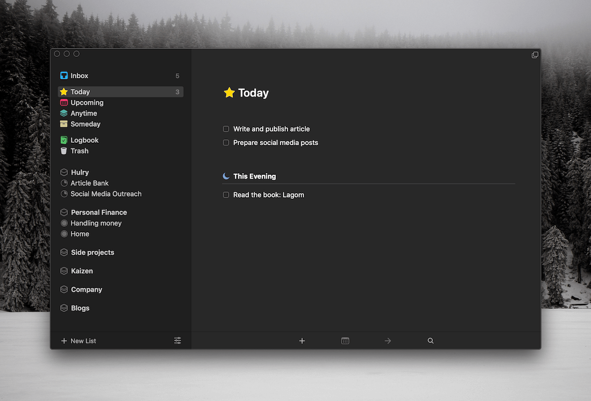
What stood out to me in the design is the ability to segregate tasks based on the time of the day.
I work on my personal projects in the morning and during the evening — before and after my office hours.
This layout allowed me to look at tasks based on the current half of the day.
Although a similar segmentation is possible in Todoist with a filter, it’s not as natural and beautiful as the one in Things.
Another subtle UX I liked in Things 3 is that unlike Todoist, overdue tasks get pushed to the next day without any bright red warnings.
Finally, keyboard shortcuts are wicked good in Things 3.
I can control and navigate the entire desktop app with just the keyboard.
Todoist’s desktop app has some keyboard shortcuts, but they are nowhere near what Things 3 supports.
However:
Things 3’s charm started to wear off as I continued using it
Things 3’s UI based organisational features started becoming annoying after some time since I was accustomed to Todoist’s swift natural language input.
Initially, I thought I could get used to this new flow, but as I started adding more and more tasks to Things, the difference started to show up.
Let’s watch a demo of what I’m talking about here:
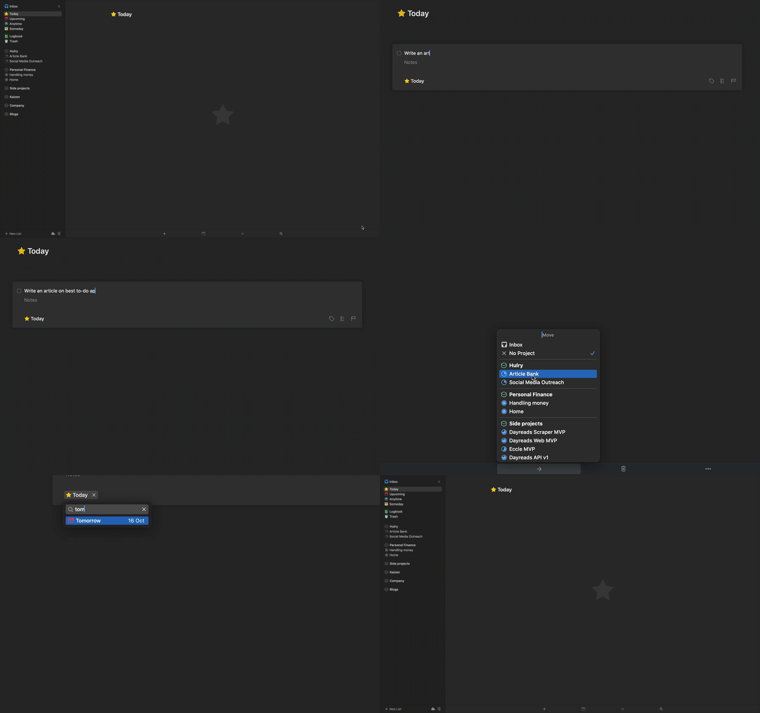
I’ll add a task to “Write an article on best to-do apps” to both Things 3 and Todoist.
Things 3
I’ll add the task and organise it into a project called “Article Bank”, and schedule it for tomorrow:
Todoist
I’ll add the same task into a project called “Articles” and schedule it for tomorrow:
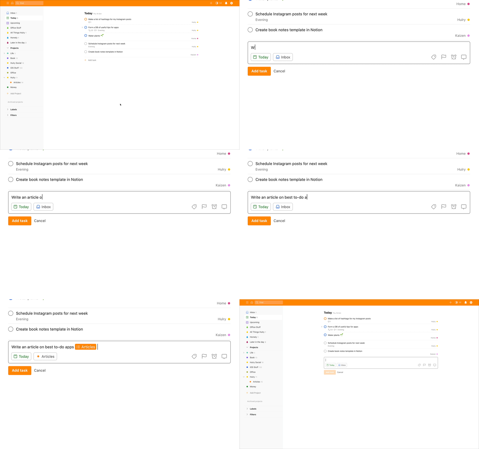
See how easy and fast it is to add and organise a task in Todoist compared to Things?
Also:
Things 3 is an Apple ecosystem-only app.
Although both my personal and office laptops are a MacBook, they are signed in using two different Apple IDs.
This meant I couldn’t use Things 3 on my work laptop unless I sign in with my personal Apple ID because I had purchased Things with my personal Apple ID.
To use Things 3 on my work laptop, I would’ve had to repurchase it using my work Apple ID.
Since Todoist is available as a web app as well, I can easily log in to Todoist on a browser and use it everywhere.
But, the most influential factor that brought me back to Todoist was:
Todoist’s ability to integrate with various services
Recently, I wanted to build a flow where when someone supports the Hulry project, the service should automatically add a task on my to-do list like this:

Since I was using Things 3 at that time, I checked IFTTT if there were some integrations for Things.
And as expected, there weren’t any.
So, I installed Todoist and created an integration using IFTTT and Todoist to do the job.
That was the moment I realised another thing I was missing out by using Things over Todoist — amazing Todoist integrations.
One thing to note, though:
Things 3 does allow creating a personalised email address where you can email a task to add to the inbox.
And we can make use of this feature to automate the addition of tasks to our inbox via services like IFTTT or Zapier.
However, the Mail to Things feature is highly limited.
We can only set the task title and a note for the task with this approach — nothing else.
So, this wasn’t going to be a viable option for me.
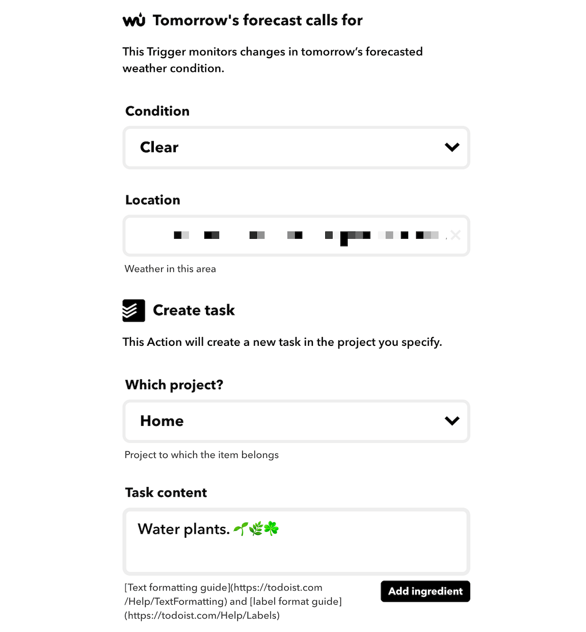
Another integration that sealed the deal was to add a “Water plants” reminder based on the weather.
I created an applet on IFTTT to add a task to my to-do list called “Water plants” only if tomorrow is going to be a clear and sunny day.
So, instead of a dumb “every two days” reminder, I have a reminder that feels like an assistant adds it.
Here’s how my applet on IFTTT is configured:
Now:
I didn’t want to maintain two to-do apps — one for automated reminders and another for my regular tasks.
After using the free version of Todoist for a few days, I converted back to a premium user.
One of the things that I was happy getting back as part Todoist’s premium tier was:
The powerful filtering mechanism
Todoist allows me to create complex filters to see only the tasks I want to see at the moment.
For example, I’ve created the following filters to scope out tasks during the day:
All things Hulry
This filter allows me to view what I need to work on for Hulry during the day time, and the filter query looks like this:
(today | overdue) & ##hulry & !@evening
The ## notation collects tasks from the Hulry project and all its sub-projects.
Office stuff
With this filter, I narrow down to the tasks which are related to my full-time job.
(today | overdue) & #office
Later in the day
This is the filter that I use to look at the tasks I had planned to finish during the evening — after logging off from my office work.
(today | overdue) & @evening
Things 3 does offer to narrow down tasks with filters, but it’s not that great.
With Things 3, I had to label my tasks, and only then I could choose to view tasks by labels.
Now, the question is:
Should you ditch Things 3 for Todoist?
It’s not a no-brainer move.
Things 3 is a beautiful and adequately functional app. If you’re using it and you’re content with your workflow, stay with Things 3.
One of the advantages of using Things 3 is that it’s a one-time purchase. In contrast, Todoist’s premium tier is an ongoing subscription model.
And for the useful features like labels, filters and reminders, you need to have a premium subscription on Todoist — costing $48/year.
For my to-do lists, I needed to break out of the Apple ecosystem, so moving to Todoist made sense to me.
Your case might be different. Choose accordingly.
Here’s a video guide that will help you get started with the app:


 In-depth articles, series and guides


